Web design & development, brand identity
Mhairi’s site had to avoid many of the cliches of the genre without turning off her key readership.
The brief
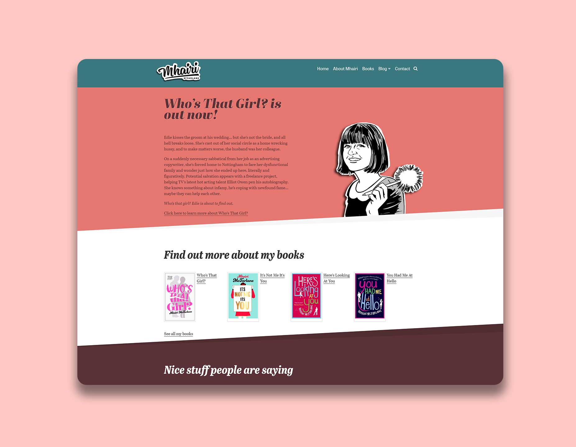
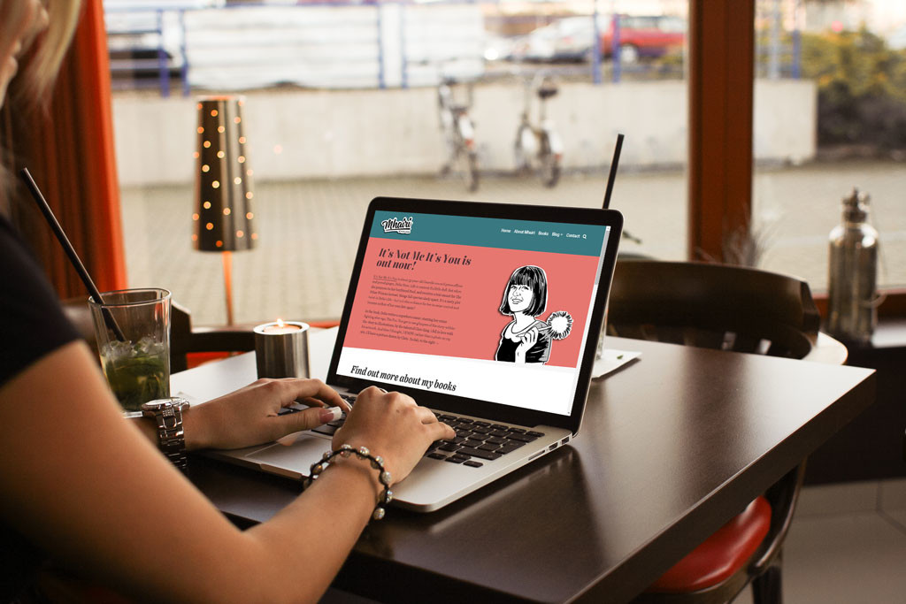
Mhairi McFarlane approached me to design and build her a website in time for the launch of her latest book, “It’s Not Me, It’s You”. One of the challenges of the brief was to come up with a brand identity for Mhairi, who works in the “Chick-lit” genre, that steered well clear of the typical pastel shades and cupcake images, without alienating her core readership.
In terms of functionality, the site had to be easy for Mhairi to add content to, and easy for the user to navigate. One important factor was that Mhairi’s books are for sale around the world, through a wide range of retailers, so provision had to be made for all these outbound links, both in terms of input and user interface.
Sketches & Wireframes
As is my habit, I turned first to good, old-fashioned pen and paper to sketch out some ideas and put together a set of wireframes around which we could discuss layout and fuctionality.
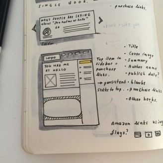
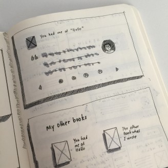
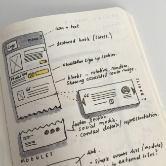
These wireframes allowed us to discuss the placement of content such as the reader quotes on the homepage, or the purchase options on the book pages, as well as the detail of what we wanted to include. When the time came to code up the prototype, I had a clear idea of how the site would look and work.
Final Site
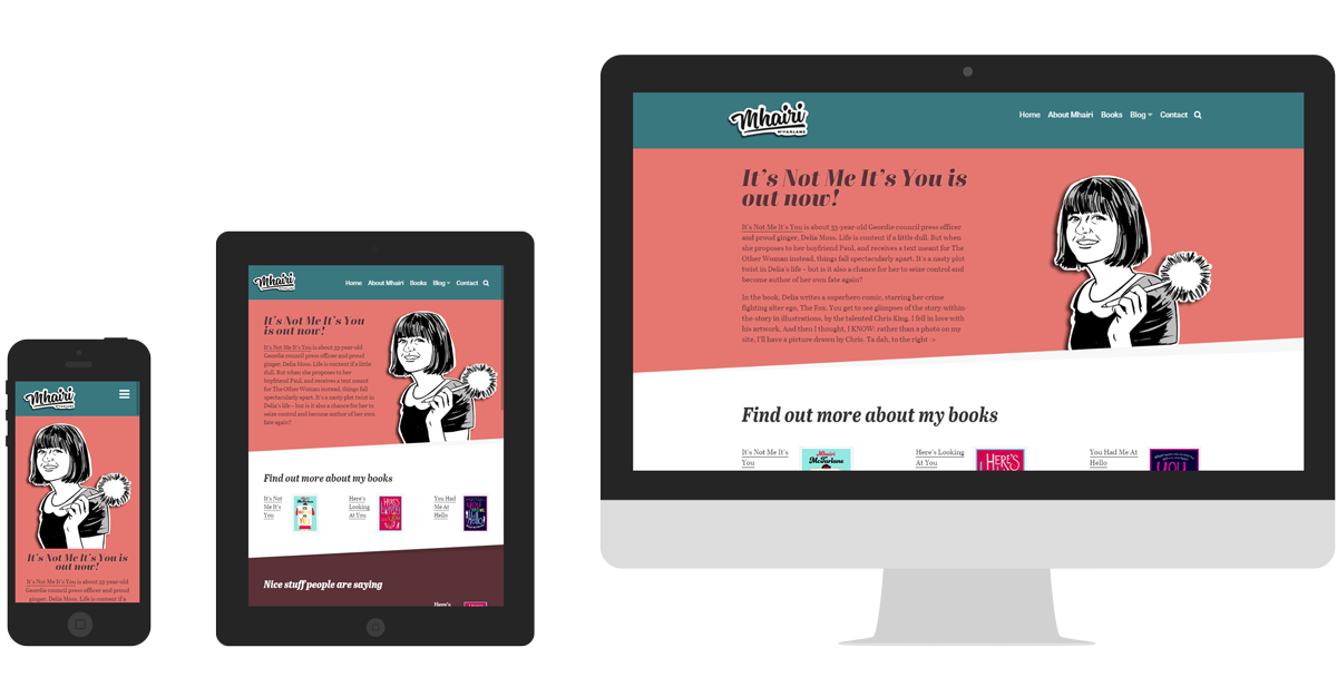
The final site was designed to be responsive, uses WordPress as the back-end, and is graced by a illustration by the wonderfully talented Chris King.
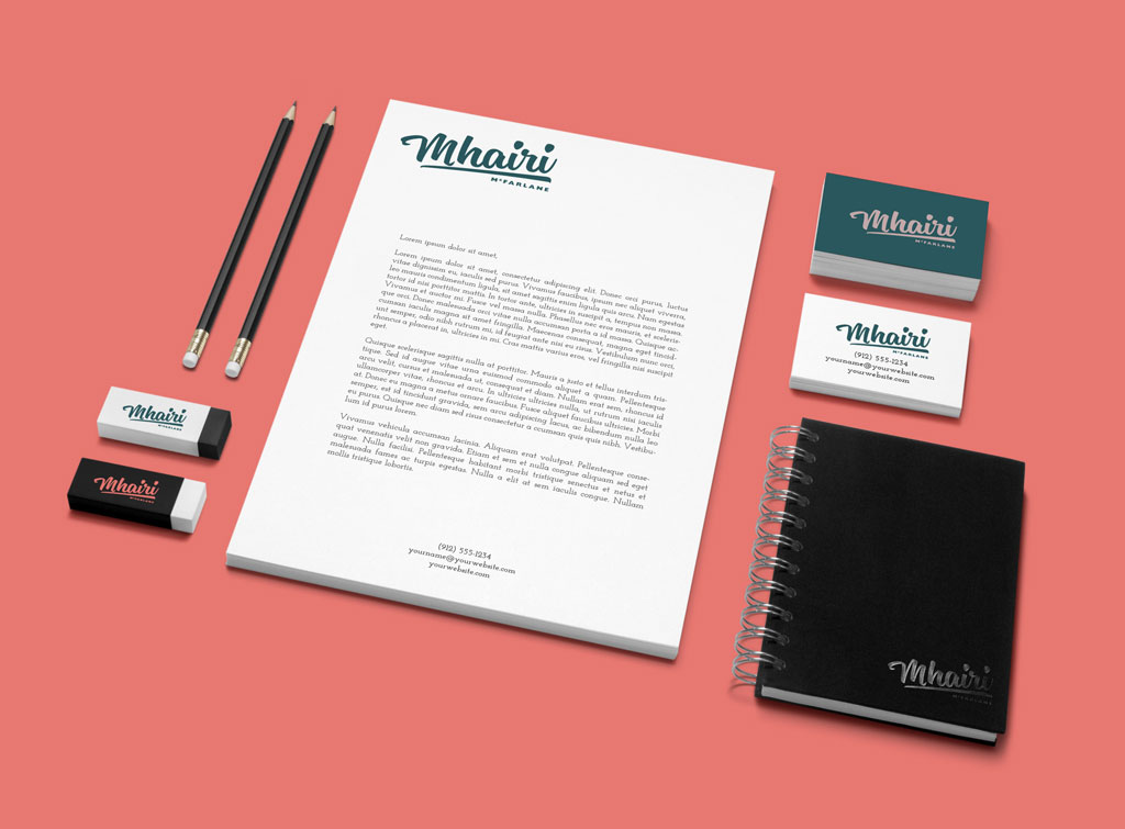
Brand Identity
As requested, Mhairi sent me examples of some of the branding prevalent in the “chick lit” genre, with clear instructions to STAY AWAY! However, the target demographic remained the same. After much discussion, the final colour scheme was agreed: strong, earthy and with a pink that was acceptable!

Turning to the logo, Mhairi was happy with the retro script used on the cover of her previous book, but I felt it could be enhanced by focusing on her first name. We also looked a range of scripts and found one that downplayed the retro aspect and wasn’t too girly.
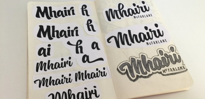
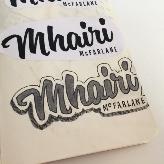
The final logo.
Then, all that remained was to apply the colour palette!
See Mhairi’s site in all it’s non-girly glory at www.mhairimcfarlane.com.